A practical blueprint for building a consistent, on-brand attendee journey across web, email, mobile, and on-site touchpoints. This guide is for marketing, operations, and design teams that want a polished look and feel without custom development. When you want to see options for branded apps, domains, and themes, explore white label.

What counts as white-label branding and attendee experience?
White-labeling covers the visual and experiential elements that make your event feel like an extension of your brand, not your platform provider. It spans domains and SSL, color and typography tokens, logos and iconography, registration pages and emails, mobile app theming, on-site kiosks and badges, and sponsor placements. To evaluate any approach, keep these dimensions in view:
- Brand system and tokens, logos, colors, type scales, icon sets, and dark-mode rules.
- Domains and messaging, custom domains and subdomains, SSL, email and SMS sender setup.
- Web registration and content, page layouts, components, accessibility, and performance.
- Mobile app and in-venue, app theme, icons, splash screens, and kiosk theming.
- On-site materials, badges, signage, wayfinding, and printer stock choices.
- Governance and approvals, roles, workflows, audit logs, and localization.
How brand and experience should flow, at a glance
Your brand kit feeds consistent tokens to the registration site, emails, mobile app, and on-site systems. Those surfaces pull session data, speaker content, and exhibitor profiles from the event platform so design stays in sync as content changes.
- Sources, central brand kit with color variables, type, logos, and sponsor assets.
- Destinations, registration and agenda pages, transactional emails, mobile app, check-in and badge printers, signage files.
- Controls, custom domains with SSL, DNS for email, role-based approvals, accessibility checks, and performance budgets.
A simple principle: the closer a touchpoint is to the attendee, the more valuable brand consistency becomes, for example matching email colors and button labels to the registration site, and using the same type sizes on badges and in the mobile app.
Outcome-first playbooks
Each playbook explains why it matters, what good looks like, and how to verify it quickly in your own stack.
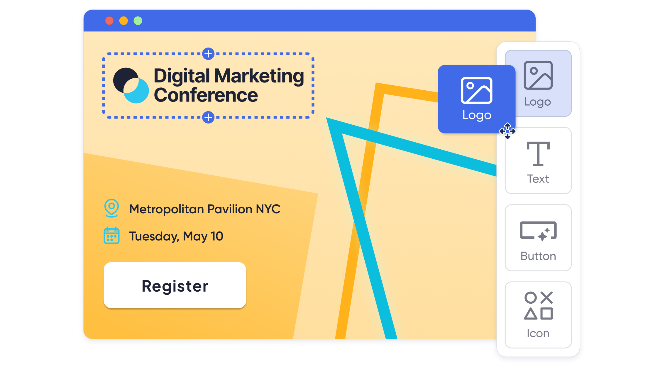
Playbook 1: Establish your brand kit and approval workflow
Why it matters
One source of truth prevents drift across pages, emails, the app, and on-site materials.
What good looks like
- A documented kit, logo variants, favicon and app icon sizes, color tokens with contrast ratios, and type scales.
- Language and tone guidelines, button labels, error copy, and micro-interactions.
- Clear roles for design, marketing, and operations, with an approval path and audit log.
- Localization plan for primary languages and a checklist for alt text and captions.
Verify
Apply the kit to a test event page and a transactional email, then run an accessibility pass for contrast and link focus. Confirm change history is logged.
For a pragmatic planning backdrop, skim from chaos to cohesion, how to simplify events with all-in-one event management software and feature priorities in top event management software features to help you stay competitive.
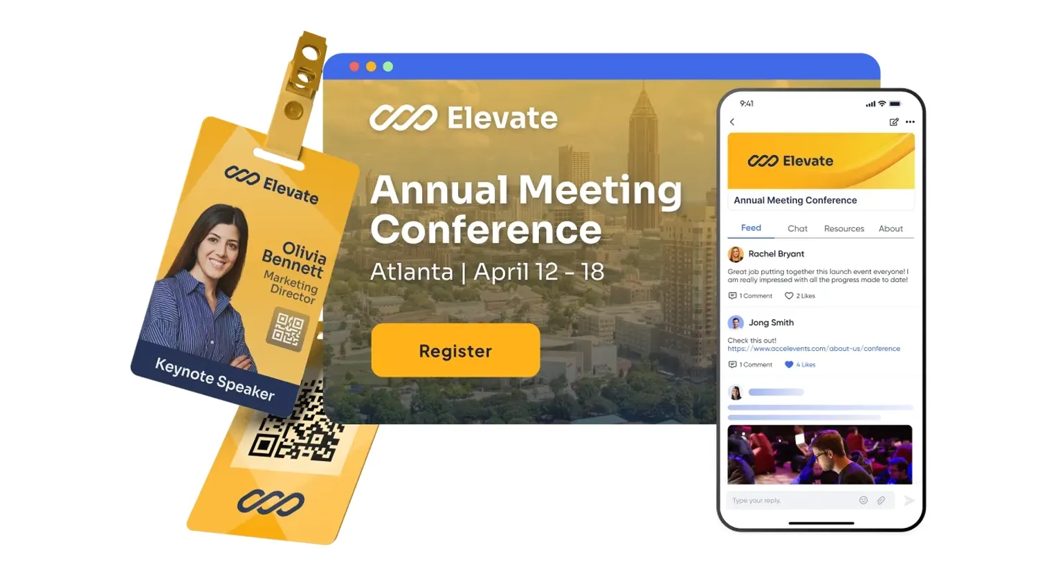
Playbook 2: Brand registration pages and transactional communications
Why it matters
Registration and confirmations are your first impression. Cohesive design improves trust and conversion.
What good looks like
- Custom domain with SSL, branded navigation, colors, and button styles.
- Modular sections, hero, agenda highlights, speakers, and social proof.
- Transactional emails that mirror site styling and include calendar holds.
- Forms that adapt by attendee type with clear validation and minimal friction.
Verify
Load the page on mobile and desktop, complete a test order, and review the confirmation email. Check that forms adapt by role and preserve UTMs.
To tighten inputs and reduce drop-off, use how to add conditional logic to your event registration form. If teams are weighing tooling tradeoffs, share 7 types of event management software.
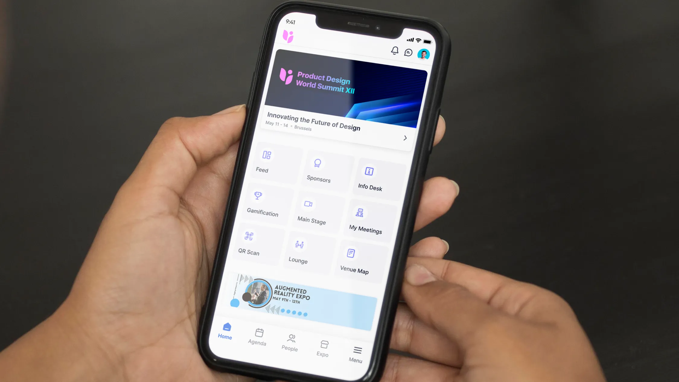
Playbook 3: White-label the mobile app and in-app navigation
Why it matters
Attendees spend hours in the app for schedules, maps, and networking. A branded look and consistent labels reduce confusion.
What good looks like
- App theme with brand colors, icons, splash, and login screens.
- Home screen widgets for “My Schedule,” “Map,” “Exhibitors,” and “Messages.”
- Consistent labels across email, web, and app, for example “Add to schedule” and “Check in.”
- Optional dark mode with accessible contrast.
Verify
Install the test build, confirm the icon and splash screen, then navigate a saved session, map, and exhibitor profile.
For mobile planning ideas and attendee UX patterns, see 12 best event apps for conference success in 2024.
Playbook 4: Design on-site touchpoints, badges, signage, and kiosks
Why it matters
On-site materials communicate brand quality and affect flow at the door and on the floor.
What good looks like
- Badge templates with large first name, readable affiliation, and a scannable code plus quiet zone.
- Kiosk and desk layouts with branded headers and high-contrast wayfinding.
- Printer stock matched to volume, with reprint controls and logs.
- Signage system, tall banners for lanes and repeated eye-level placards.
Verify
Print ten test badges, scan from 1 meter away, and time a check-in with reprint. Walk the route with signage placed and confirm visibility.
Choose hardware using how to choose an event badge printer for your next event and apply design basics from event badges, everything you need to know in 2025. If layouts are complex, coordinate with 5 best event floor plan software.
Playbook 5: Package sponsor and exhibitor branding without breaking UX
Why it matters
Sponsors expect visibility, attendees expect clarity. A balanced system earns renewals and preserves usability.
What good looks like
- Tiered placements, logo on home screen tiles, session sponsor ribbons, and branded push messages.
- Exhibitor profiles with media blocks, CTAs, and meeting booking that match your theme.
- Shareable, branded ROI dashboards for exhibitors and sponsors.
- Guardrails for frequency and placement to avoid visual overload.
Verify
Preview sponsor ribbons on the session list, a branded push message, and an exhibitor profile with CTAs. Export a sponsor snapshot and confirm styling persists.
For program ideas and practical booth tactics, see beyond the booth, elevating trade show success with strategic engagement and technology.
Pre-build checklist
Use this 4 to 6 weeks before launch.
- Finalize logo variants, color tokens, and type scale, including dark-mode rules.
- Reserve your custom domain or subdomain and configure SSL.
- Set DNS for email and SMS senders, test deliverability.
- Prepare component library, buttons, cards, section headers, and list styles.
- Collect sponsor assets and define placements by tier.
- Set accessibility budget, contrast, focus states, and link styles.
Launch-day checklist
Use this from 90 minutes before go-live through first traffic spike.
- Smoke-test pages on mobile and desktop, run a GTM Preview if used.
- Trigger a test registration and confirm branded confirmation email and calendar hold.
- Install the app test build, verify icon, splash, and menu labels.
- Print a proof set of badges, confirm scannability and reprint logs.
- Walk signage routes and adjust sightlines.
Post-event optimization checklist
Use this in the first week after the show.
- Review heatmaps and click paths on registration and schedule pages.
- Compare app engagement by feature tile and adjust home screen layout.
- Reconcile badge and kiosk logs with attendance reports.
- Capture sponsor feedback and refine placement guidelines.
- Update the brand kit with any new rules discovered on site.
Systems map, the picture in words
Your brand kit sits at the center. Registration pages and emails pull tokens for colors and type, the mobile app consumes the same theme, and on-site systems load badge templates and kiosk headers. Content updates from the event platform, sessions and speakers and exhibitors, populate all surfaces consistently. Monitoring watches uptime, page speed, and email deliverability. Approvals and logs document who changed what and when.
Mini comparisons to request in a demo
Ask vendors to show, not tell.
- Custom domain with SSL, branded pages, and a transactional email styled to match.
- Mobile app theme, icon, splash, and home screen tiles that use your brand tokens.
- Branded check-in kiosks and badge templates with fast reprints and logs.
- Sponsor placements across web, app, and on-site views with frequency controls.
- Accessibility checks for contrast and focus states across pages and app.
- Export or API options for brand assets and component reuse.
If you want to see these patterns operating together, look at white label.
Governance and scale
Brand excellence becomes durable when ownership and documentation are explicit. Assign a steward for the brand kit, centralize tokens, and schedule seasonal reviews for accessibility and performance. As your program grows, templatize page sections, badge layouts, and sponsor placements, then version your kit so changes roll out predictably across web, app, and on-site.
FAQs
What is the difference between branded event pages and a white label attendee experience?
Branded pages use your colors and logos on the provider’s domain, while a true white label setup uses your domains, sender identities, and app theming so the platform fades into the background. For event organizers this means URLs, icons, login screens, and kiosks all look like a natural extension of your brand. Platforms like Accelevents offer a highly customizable white label environment across web, mobile, and on site so you can keep design consistent without custom development.
Do we really need a custom domain for event registration sites and emails?
Using a custom domain for event registration and confirmations builds trust, improves click through rates, and keeps the experience aligned with your main website. It also helps preserve UTM tracking for marketing and reduces the chance that security conscious attendees hesitate when they see an unfamiliar URL. Make sure SSL is enabled and that DNS is configured for email and SMS senders so deliverability stays strong.
Can we launch a fully branded mobile event app without building our own from scratch?
Yes, many event platforms provide a white label or branded container app so you can ship an experience with your icon, colors, and splash screens without custom coding. Depending on your plan you may use a shared container with theming or publish a standalone app store listing under your organization’s name. Work with your provider’s support team to confirm asset specs, submission timelines, and how updates are pushed during show week.
How should we balance sponsor visibility with a clean attendee user experience in a white label app?
The safest approach is to use clear tiers, predictable placements, and frequency caps so sponsors are visible but never overwhelming. Put core navigation and primary calls to action in uncluttered areas, then use consistent locations for sponsor ribbons, home screen tiles, and sponsored messages. Your platform’s customer success partner can often share patterns that keep sponsor value high while preserving readability and wayfinding.
What accessibility standards should we enforce for branded pages, mobile apps, and badges?
Aim for WCAG aligned contrast ratios, keyboard focus states, and descriptive alt text on all key graphics. Use readable font sizes on badges and in-app labels, avoid relying on color alone to convey meaning, and test on both bright and low light screens. A quick pass with a screen reader and a manual check of tab order on your main pages will catch many common issues before launch.
Ready to deliver a seamless, on-brand experience end to end?
Request a demo and we will tailor white-label branding to your sites, app, and on-site needs.